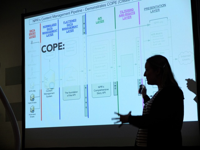
For years, we've been telling designers: the web is not print. You can't have pixel-perfect layouts. You can't determine how your site will look in every browser, on every platform, on every device. We taught designers to cede control, think in systems, embrace web standards. So why are we still letting content authors plan for where their content will "live" on a web page? Why do we give in when they demand a WYSIWYG text editor that works "just like Microsoft Word"? Worst of all, why do we waste time and money creating and recreating content instead of planning for content reuse? What worked for the desktop web simply won't work for mobile. As our design and development processes evolve, our content workflow has to keep up. Karen will talk about how we have to adapt to creating more flexible content.
For more than 15 years Karen McGrane has helped create more usable digital products through the power of user experience design and content strategy. Today, as Managing Partner at Bond Art + Science, she develops web strategies and interaction designs for publishers, financial services firms, and healthcare companies. Prior to starting Bond, Karen helped build the User Experience practice at Razorfish, hired as the very first Information Architect and leaving as the VP and National Lead for UX.
Karen says: Here’s some better links for that talk:

No comments:
Post a Comment